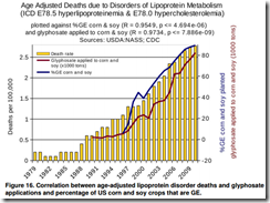
In my Facebook feed, a friend posted a very scary-looking study that links genetically engineered (GE) crops to the rise in 22 diseases. These are pretty fearsome diseases, too, like bile duct cancer and pelvis cancer. For instance1:

There are a few ways to respond to this article:
First, it has not passed my attention that the second author has published a book Myths of Safe Pesticides, which has been analyzed and debunked by Harriet Hall.
Second, I could just say "correlation is not causation." QED. Article debunked, and can be swept to the dustbin.
Third, I can point out the correlation between sales of organic produce and autism. (Yikes!) In fact, using the methods of this article, I can probably prove a significant correlation between sales of organic produce and bile cancer, kidney cancer, autism, or lipoprotein disorder deaths. We can all grab our glyphosate-coated pitchforks and demand reform!
However, I think there are some statistical lessons here, and it's sometimes good to deconstruct some misused and abused statistics. And trust me, the statistics in this article are seriously misused. In fact, it might be an interesting project for an introductory graduate statistics class to collect articles like this and critique them. I'll do it for fun here. There are others that can speak to the scientific aspects of the article, like how it disagrees with the results of a review of over a trillion meals fed that incorporate GE products. There's also other quibbles with the article, like how it sometimes conflates pesticide discussions with glyphosate (an herbicide), that others can deconstruct.
When deciding on how to summarize and analyze data statistically, it is essential to work with the nature of the data. This article fails on several counts. First, it smashes together data from two complete different sources without considering how the data are related. Now, I'm generally excited to see data from disparate sources linked and analyzed together, but it has to be done carefully. This is how they obtained their data on GE use:
From 1990-2002, glyphosate data were available for all three crops, but beginning in 2003 data were not collected for all three crops in any given year. Data on the application rates were interpolated for the missing years by plotting and calculating a best fit curve. Results for the application rates for soy and corn are shown in Figures 2 and 3. Because the PAT was relatively small prior to about 1995, the sampling errors are much larger for pre-1995 data, more so for corn than for soy. Also, data were not missing until 2003 for soy and 2004 for corn. For these reasons, the interpolated curves begin in 1996 for soy and 1997 for corn in Figures 2 and 3.
This is how they obtained epidemiological data:
Databases were searched for epidemiological data on diseases that might have a correlation to glyphosate use and/or GE crop growth based on information given in the introduction. The primary source for these data was the Centers for Disease Control and Prevention (CDC). These data were plotted against the amount of glyphosate applied to corn and soy from Figure 6 and the total %GE corn and soy crops planted from Figure 1. The percentage of GE corn and soy planted is given by: (total estimated number of acres of GE soy + total estimated number of acres of GE corn)/(total Estimated acres of soy + total estimated acres of corn)x100, where the estimated numbers were obtained from the USDA as outlined above.
This seems innocent enough, but there's already a lot of wrong happening here. It's good that they explained some of their data cleaning, though we can always stand for more transparency behind this step. It's not scientifically glorious to describe how you handle missing or sparse data, but mishandling such can certainly sink your Nobel prize work. It's also good to explain derived variables, though I haven't gone back and checked their math.
The first fatal error is how they link the data. They simply merge it by year. It's the obvious-seeming step that already tanks their analysis. This is the same kind of merging that links, say, sales of organic crops to autism. Mashing up data needs to be done in a scientifically valid way, and simply merging disparate data by year isn't going to cut it here. All these data they gathered are crude summaries, and they just strung them together by year without giving any thought to whether the subjects in the epidemiological database have any connection to the subjects in the GE database. Sloppy, and that right there can be enough to tank any analysis, even if the analysis were well done. Which this one wasn't.
The second fatal error is how they present the data. Take the Figure 16 above. This graph breaks so many rules of data presentation that Edward Tufte's head would probably explode just from looking at it. But let's dig a little deeper. The authors say they plotted incidence of disease (in Figure 16 it's age-adjusted deaths due to lipoprotein disorder) against GE and glyphosate use. However, if you want to get technical about it, they plot all three of these versus time. This is a very important distinction. If they plotted incidence versus GE use, then they would put GE use on the x-axis. However, they show incidence in bar graphs by time, GE use in a line graph by time, and glyphosate use by time. I'll explain why this is important in the discussion of the third fatal flaw. But let's move ahead with the graph. From what I've been able to figure out, the left y-axis goes with the bar graph and is in deaths per hundred thousand. The axis on the right does double duty and covers both % of GE planted and 1000 tons of glyphosate used. It took me a while to figure that out, and it's very sloppy design anyway (the two scales have nothing to do with each other). If you ever see a line plot with a left and right y-axis, get skeptical. Here, the left axis starts at 0 and ends at 2.75 or so, and the right axis starts at -20 (!) and ends at 85 or so. I can see why they chose the y-axis, but the right axis is very curious. The -20 is a terrible choice for the start of the right axis. It's an invalid value of % of GE crops planted and 1000s of tons of glyphosate used. “Yes, Monsanto, I used -20,000 tons of glyphosate. You owe me $50,000.” It seems that the origin and scale of the right y-axis was chosen specifically to make GE and glyphosate use appear to track closely with deaths. I usually choose incompetence over malice to explain motivations, but it's very challenging to support incompetence in this case. It takes talent and/or effort to choose axes like this. I'll leave a deconstruction of the other graphs as an exercise, perhaps for your graduate-level stats class.
The third and final fatal error is how they analyze the data. Their analysis is the statistical equivalent to bringing a knife to a gunfight. They basically take all the GE and epidemiological data, ignore the time component, and send it through your Stat 101 Pearson correlation estimator formula. They construct some p-values, unsurprisingly find a massively small p-value, declare victory, and hit the publish button. Problem is, they compute the wrong statistical summary using the wrong formula and use it to make the wrong inference. The Pearson correlation estimator they use is designed for independent data, not time series data (and they know it's time series data because they say so on p. 11). Time series data has a complex correlation structure, and thus estimating second-order parameters like correlations is a bit of a challenge. For instance, GE use this year is going to be heavily correlated to GE use last year, as are deaths from lipoprotein disorders. Does the correlation reflect a relationship between death and GE use, or death this year and death last year? The naïve estimate assumes the correlation is between death and GE use, and accounts nothing of the relationship between deaths this year and last year (in the stat world we call this autocorrelation). Though I haven't done the math, my guess is that the correlation between death and GE use will be greatly reduced if not disappear altogether if time is taken into account. And even if there is a nonzero, significant correlation, the fact of the matter is that there needs to be a stronger link than time between the GE data and epidemiological data.
As a bonus, the paper claims to find a link between GE crop use, glyphosate use, and a whole bunch of nasty stuff, but they never try to tease out whether the nasty stuff is attributable to glyphosate or GE crops.
In conclusion, the paper claims to find a strong link between GE crop use and glyphosate use, and a host of diseases. Given that their paper was so deeply methodologically flawed, they are unable to support their conclusions. This paper should not be considered as evidence of the dangers of GE crop use or glyphosphate use, but should rather be used as a showcase of "How Not to Do It."
Edit: I need to learn how to spell glyphosate.
Footnotes:
1Swanson, Leu, Abrahamson, and Wallet. "Genetically engineered crops, glyphosphate and the deterioration of health in the United States." Journal of Organic Systems. 9(2), 2014. Figure 16.
