Biostatistics, clinical trial design, critical thinking about drugs and healthcare, skepticism, the scientific process.
Tuesday, April 14, 2015
Helicopter parenting because your mind is "terrible at statistics" (or, rather, you are unaware of the denominator)
What we do not hear, because it does not sell on cable news, is is the denominator. For all (very few) children abducted by strangers, for instance, we do not hear of the ones who successfully played at the park, or walked to the library, or went down to the field to play stickball (or I guess nerf softball because we shouldn't be throwing hard objects anymore) without getting abducted. This is because those stories do not sell.
I guess the second best is reporting on trends in parenting, and how they are driven by how bad we are at statistics (even statisticians).
Thursday, March 19, 2015
Lying with statistics, CAM version
Full disclosure here: at one time I wanted to be a complementary and alternative (CAM) researcher. Or integrative, or whatever the cool kids call it these days. I thought that CAM research would yield positive fruit if they could just tighten up their methodology and leave nothing to question. While this is not intended to be a discussion of my career path, I’m glad I did not go down that road.
This article is a discussion of why. The basic premise of the article is that positive clinical trials do not really provide strong evidence of an implausible therapy, for much the same reason that doctors will give a stronger test to an individual who tests positive for HIV. A positive test will provide some, but not conclusive, evidence for HIV simply because HIV is so rare in the population. The predictive value of even a pretty good test is poor. And the predictive value of a pretty good clinical trial is pretty poor if the treatment has not been established.
Put it this way, if we have a treatment that has zero probability of working (the “null hypothesis” in statistical parlance), there will be a 5% probability that it will show a significant result in a conventional clinical trial. But let’s turn that on its head using Bayes Rule:
Prob (treat is useless| positive trial) * Prob(positive trial) = Prob (positive trial | treatment is useless) * Prob (treat is useless) (ok, this is just the definition of Prob (treat is useless AND positive trial)
Expanding, and using the law of total probability:
Prob (treat is useless| positive trial) = Prob (positive trial | treatment is useless)* Prob (treat is useless) / ((Prob positive trial|treat is useless)*Prob(treat is useless) + Prob(positive trial|treat is not useless)*Prob(treat is not useless))
Now we can substitute, assuming that our treatment is in fact truly useless:
Prob (treat is useless| positive trial) = p-value * 1 / (p-value * 1 + who cares * 0) = 1
That is to say, if we know the treatment is useless, the clinical trial is going to offer no new knowledge of the result, even if it was well conducted.
Drugs that enter in human trials are required to have some evidence for efficacy and safety, such as that gained from in vitro and animal testing. The drug development paradigm isn’t perfect in this regard, but the principle of the requirement of scientific and empirical evidence for safety and efficacy is sound. When we get better models for predicting safety and efficacy we will all be a lot happier. The point is to reduce the probability of futility to something low and maximize the probability of a positive trial given the treatment is not useless, which would result in something like:
Prob (treat is useless | positive trial) = p-value * <something tiny> / (p-value * something tiny + something large * something close to 1) = something tiny
Of course, there are healthy debates regarding the utility of the p-value. I question it as well, given that it requires a reference to trials that can never be run. These debates need to be had among regulators, academia, and industry to determine the best indicators of evidence of efficacy and safety.
But CAM studies have a long way to go before they can even think about such issues.
Monday, March 16, 2015
Lying with statistics, anti-vax edition 2015
Sometimes Facebook’s suggestions of things to read lead to some seriously funny material. After clicking on a link about vaccines, Facebook recommended I read an article about health outcomes in unvaccinated children. Reading this rubbish made me as annoyed as a certain box of blinking lights, but it again affords me the opportunity to describe how people can confuse, bamboozle, and twist logic using bad statistics.
First of all, Health Impact News has all the markings of a crank site. For instance, its banner claims it is a site for “News that impacts your health that other media sources may censor.” This in itself ought to be a red flag, just like Kevin Trudeau’s Natural Cures They Don’t Want You to Know About.
But enough about that. Let’s see how this article and the referred study abuses statistics.
First of all, this is a bit of a greased pig. Their link leads to a malformed PDF file on a site called vaccineinjury.info. The site’s apparent reason for existence is to host a questionnaire for parents who did not vaccinate their children. So I’ll have to go on what the article says. There appeNo study of health outcomes of vaccinated people versus unvaccinated has ever been conducted in the U.S. by CDC or any other agency in the 50 years or more of an accelerating schedule of vaccinations (now over 50 doses of 14 vaccines given before kindergarten, 26 doses in the first year).ars to be another discussion on the vaccineinjury.info site, which I’ll get to in a moment.
The authors claim
No study of health outcomes of vaccinated people versus unvaccinated has ever been conducted in the U.S. by CDC or any other agency in the 50 years or more of an accelerating schedule of vaccinations (now over 50 doses of 14 vaccines given before kindergarten, 26 doses in the first year).
Here’s one. A simple Pubmed search will bring up others fairly quickly. These don’t take long to find. What happens after this statement is a long chain of unsupported assertions about what data the CDC has and has not collected, that I really don’t have an interest in debunking right now (and so leave as an exercise).
So on to the good stuff. They have a pretty blue and red bar graph that’s just itching to be shredded, so let’s do it. This blue and red bar graph is designed to demonstrate that vaccinated children are more likely to develop certain medical conditions, such as asthma and seizures, than unvaccinated children. Pretty scary stuff, if their evidence were actually true.
One of the most important principles in statistics is defining your population. If you fail at that, you might as well quit, get your money back from SAS, and call it a day, because nothing that comes after that is meaningful. You might as well make up a bunch of random numbers if that’s the case, because that will be just as meaningful.
This study fails miserably at defining its population. The best I can tell, the comparison is between a population in an observation study called KIGGS and respondents to an open invitation survey conducted at vaccineinjury.info.
What could go wrong? Rhetorical question.
We don’t know who responded to the vaccineinjury.info questionnaire, but it is aimed at parents who did not vaccinate their children. This pretty much tanks the rest of their argument. From what I can tell, these respondents seem to be motivated to give answers favorable to the antivaccine movement. That the data they present are supplemented with testimonials gives this away. They are comparing apples to rotten oranges.
The right way to answer a question like this is a matched case-control study of vaccinated and unvaccinated children. An immunologist is probably the best one to determine which factors need to be included in the matching. That way, an analysis conditioned on the matching can clearly point to the effect of the vaccinations rather than leave open the questions of whether the differences in cases were due to differences in inherent risk factors.
I’m wondering if there isn’t some ascertainment bias going on as well. Though I really couldn’t tell what the KIGGS population was, it was represented as the vaccinated population. So in addition to imbalances in risk factors, I’m wondering if the “diagnosis” in the unvaccinated population was derived from the parents were asked which medical conditions their children have. In that case, we have no clue what the real rate is like, because we are comparing parents’ judgments (and parents probably more likely to ignore mainstream medicine at that) with, presumably, a GP’s more rigorous diagnosis. That’s not to say that no children in the survey were diagnosed by an MD, but without that documentation (which this web-based survey isn’t going to be able to provide), the red bars in the pretty graph are essentially meaningless. (Which they were even before this discussion.)
But let’s move on.
The vaccineinjury.info cites some other studies that seem to agree with their little survey. For instance, McKeever, et al. published a study in the American Journal of Public Health in 2004 from which the vaccineinjury.info site claims an association between vaccines and the development of allergies. However, that apparent association, as stated in the study, is possibly the result of ascertainment bias (the association was only strong in a stratum with the least frequent GP visits). Even objections to the discussion of ascertainment bias leave the evidence of association of vaccines and allergic diseases unclear.
The vaccineinjury.info site also cites the Guinea-Bisseau study reported by Kristensen et al.in BMJ in 2000. They claim, falsely, that the study showed a higher mortality in vaccinated children.
They also cite a New Zealand study.
What they don’t do is describe how they chose the studies to be displayed on the web site. What were the search terms? Were these studies cherry-picked to demonstrate their point? (Probably, but they didn’t do a good job.)
What follows the discussion of other studies is an utter waste of internet space. They report the results of their “survey,” I think. Or somebody else’s survey. I really couldn’t figure out what was meant by “Questionnaire for my unvaccinated child ("Salzburger Elternstudie")”. The age breakdown for the “children” is interesting, for 2 out of the 1004 “children” were over 60! At any rate, if you are going to be talking about diseases in children, you need to present it by age, because, well, age is a risk factor in disease development. But they did not do this.
What is interesting about the survey, though, is the reasons the parents did not vaccinate their children, if only to give a preliminary notion of the range of responses.
In short, vaccineinjury.info, and the reporting site Health Impact News, present statistics that are designed to scare rather than inform. Proper epidemiological studies, contrary to the sites’ claims, have been conducted and provide no clear evidence to the notion that vaccinations cause allergies except in rare cases. In trying to compile evidence for their claims, they failed to provide evidence that they did a proper systematic review, and even misquoted the conclusions of the studies they presented.
All in all, a day in the life of a crank website.
Tuesday, December 9, 2014
No, a study did not link genetically engineered crops to 22 diseases
In my Facebook feed, a friend posted a very scary-looking study that links genetically engineered (GE) crops to the rise in 22 diseases. These are pretty fearsome diseases, too, like bile duct cancer and pelvis cancer. For instance1:
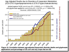
There are a few ways to respond to this article:
First, it has not passed my attention that the second author has published a book Myths of Safe Pesticides, which has been analyzed and debunked by Harriet Hall.
Second, I could just say "correlation is not causation." QED. Article debunked, and can be swept to the dustbin.
Third, I can point out the correlation between sales of organic produce and autism. (Yikes!) In fact, using the methods of this article, I can probably prove a significant correlation between sales of organic produce and bile cancer, kidney cancer, autism, or lipoprotein disorder deaths. We can all grab our glyphosate-coated pitchforks and demand reform!
However, I think there are some statistical lessons here, and it's sometimes good to deconstruct some misused and abused statistics. And trust me, the statistics in this article are seriously misused. In fact, it might be an interesting project for an introductory graduate statistics class to collect articles like this and critique them. I'll do it for fun here. There are others that can speak to the scientific aspects of the article, like how it disagrees with the results of a review of over a trillion meals fed that incorporate GE products. There's also other quibbles with the article, like how it sometimes conflates pesticide discussions with glyphosate (an herbicide), that others can deconstruct.
When deciding on how to summarize and analyze data statistically, it is essential to work with the nature of the data. This article fails on several counts. First, it smashes together data from two complete different sources without considering how the data are related. Now, I'm generally excited to see data from disparate sources linked and analyzed together, but it has to be done carefully. This is how they obtained their data on GE use:
From 1990-2002, glyphosate data were available for all three crops, but beginning in 2003 data were not collected for all three crops in any given year. Data on the application rates were interpolated for the missing years by plotting and calculating a best fit curve. Results for the application rates for soy and corn are shown in Figures 2 and 3. Because the PAT was relatively small prior to about 1995, the sampling errors are much larger for pre-1995 data, more so for corn than for soy. Also, data were not missing until 2003 for soy and 2004 for corn. For these reasons, the interpolated curves begin in 1996 for soy and 1997 for corn in Figures 2 and 3.
This is how they obtained epidemiological data:
Databases were searched for epidemiological data on diseases that might have a correlation to glyphosate use and/or GE crop growth based on information given in the introduction. The primary source for these data was the Centers for Disease Control and Prevention (CDC). These data were plotted against the amount of glyphosate applied to corn and soy from Figure 6 and the total %GE corn and soy crops planted from Figure 1. The percentage of GE corn and soy planted is given by: (total estimated number of acres of GE soy + total estimated number of acres of GE corn)/(total Estimated acres of soy + total estimated acres of corn)x100, where the estimated numbers were obtained from the USDA as outlined above.
This seems innocent enough, but there's already a lot of wrong happening here. It's good that they explained some of their data cleaning, though we can always stand for more transparency behind this step. It's not scientifically glorious to describe how you handle missing or sparse data, but mishandling such can certainly sink your Nobel prize work. It's also good to explain derived variables, though I haven't gone back and checked their math.
The first fatal error is how they link the data. They simply merge it by year. It's the obvious-seeming step that already tanks their analysis. This is the same kind of merging that links, say, sales of organic crops to autism. Mashing up data needs to be done in a scientifically valid way, and simply merging disparate data by year isn't going to cut it here. All these data they gathered are crude summaries, and they just strung them together by year without giving any thought to whether the subjects in the epidemiological database have any connection to the subjects in the GE database. Sloppy, and that right there can be enough to tank any analysis, even if the analysis were well done. Which this one wasn't.
The second fatal error is how they present the data. Take the Figure 16 above. This graph breaks so many rules of data presentation that Edward Tufte's head would probably explode just from looking at it. But let's dig a little deeper. The authors say they plotted incidence of disease (in Figure 16 it's age-adjusted deaths due to lipoprotein disorder) against GE and glyphosate use. However, if you want to get technical about it, they plot all three of these versus time. This is a very important distinction. If they plotted incidence versus GE use, then they would put GE use on the x-axis. However, they show incidence in bar graphs by time, GE use in a line graph by time, and glyphosate use by time. I'll explain why this is important in the discussion of the third fatal flaw. But let's move ahead with the graph. From what I've been able to figure out, the left y-axis goes with the bar graph and is in deaths per hundred thousand. The axis on the right does double duty and covers both % of GE planted and 1000 tons of glyphosate used. It took me a while to figure that out, and it's very sloppy design anyway (the two scales have nothing to do with each other). If you ever see a line plot with a left and right y-axis, get skeptical. Here, the left axis starts at 0 and ends at 2.75 or so, and the right axis starts at -20 (!) and ends at 85 or so. I can see why they chose the y-axis, but the right axis is very curious. The -20 is a terrible choice for the start of the right axis. It's an invalid value of % of GE crops planted and 1000s of tons of glyphosate used. “Yes, Monsanto, I used -20,000 tons of glyphosate. You owe me $50,000.” It seems that the origin and scale of the right y-axis was chosen specifically to make GE and glyphosate use appear to track closely with deaths. I usually choose incompetence over malice to explain motivations, but it's very challenging to support incompetence in this case. It takes talent and/or effort to choose axes like this. I'll leave a deconstruction of the other graphs as an exercise, perhaps for your graduate-level stats class.
The third and final fatal error is how they analyze the data. Their analysis is the statistical equivalent to bringing a knife to a gunfight. They basically take all the GE and epidemiological data, ignore the time component, and send it through your Stat 101 Pearson correlation estimator formula. They construct some p-values, unsurprisingly find a massively small p-value, declare victory, and hit the publish button. Problem is, they compute the wrong statistical summary using the wrong formula and use it to make the wrong inference. The Pearson correlation estimator they use is designed for independent data, not time series data (and they know it's time series data because they say so on p. 11). Time series data has a complex correlation structure, and thus estimating second-order parameters like correlations is a bit of a challenge. For instance, GE use this year is going to be heavily correlated to GE use last year, as are deaths from lipoprotein disorders. Does the correlation reflect a relationship between death and GE use, or death this year and death last year? The naïve estimate assumes the correlation is between death and GE use, and accounts nothing of the relationship between deaths this year and last year (in the stat world we call this autocorrelation). Though I haven't done the math, my guess is that the correlation between death and GE use will be greatly reduced if not disappear altogether if time is taken into account. And even if there is a nonzero, significant correlation, the fact of the matter is that there needs to be a stronger link than time between the GE data and epidemiological data.
As a bonus, the paper claims to find a link between GE crop use, glyphosate use, and a whole bunch of nasty stuff, but they never try to tease out whether the nasty stuff is attributable to glyphosate or GE crops.
In conclusion, the paper claims to find a strong link between GE crop use and glyphosate use, and a host of diseases. Given that their paper was so deeply methodologically flawed, they are unable to support their conclusions. This paper should not be considered as evidence of the dangers of GE crop use or glyphosphate use, but should rather be used as a showcase of "How Not to Do It."
Edit: I need to learn how to spell glyphosate.
Footnotes:
1Swanson, Leu, Abrahamson, and Wallet. "Genetically engineered crops, glyphosphate and the deterioration of health in the United States." Journal of Organic Systems. 9(2), 2014. Figure 16.

Monday, March 5, 2012
Why I hate p-values (statistical leadership, Part II)
One statistical tool is the ubiquitous p-value. If it’s less than 0.05, your hypothesis must be true, right? Think again.
Ok, so I don’t hate p-values, but I do hate the way that we abuse them. And here’s where we need statistical leadership to go back and critique these p-values before we get too excited.
P-values can make or break venture capital deals, product approval for drugs, or senior management approval for a new design of deck lid. In that way, we place a little too much trust in them. Here’s where we abuse them:
- The magical 0.05: if we get a 0.51, we lose, and if we get a 0.49, we win! Never mind that the same experiment run under the same conditions can easily produce both of these results. (The difference between statistically significant and not significant is not significant.)
- The misinterpretation: the p-value is not the probability of the null hypothesis being true, but rather the long-run relative frequency of times that data from the similar experiments run under the same conditions will produce a test statistic that is at least the value that you had in your experiment, if the null hypothesis is true. Got that? Well, no matter how small your p-value is, I can get a wimpy version of your treatment and get a smaller p-value, just by increasing the sample size to what I need. P-values depend on effect size, effect variance, and sample size.
- The gaming of the p-value: in clinical trials it’s possible to make your p-value smaller by restricting your subject entry criteria to what brings out the treatment effect the most. This is not usually a problem, except to keep in mind that the rarified world of early phase clinical studies is different from the real world.
- The unethical gaming of the p-value: this comes from retrospectively tweaking your subject population. I guess it’s ok if you don’t try to pass this off as real results, but rather as information for further study design, but you can’t expect any scientific validity to tweaking a study, its population, or its analysis after the results are in.
- Covariate madness: covariates tend to decrease the p-value by partitioning the variation in drug effect. That’s great if you want to identify segments of your patient population. But if you do covariate selection and then report your p-value from the final model, you have a biased p-value.
Statisticians need to stay on top of these issues and advocate for the proper interpretation of p-values. Don’t leave it up to someone with an incomplete understanding of these tools.
Wednesday, March 25, 2009
Challenges in statistical review of clinical trials
Monday, December 15, 2008
Question at Flowing Data: what makes statistics so uninteresting?
On a sidenote, and related more to biostatistics than general statistics, is why a group of people think that the single strongest determining factor of the results of the clinical trial is who sponsors it.
Thursday, November 13, 2008
Autism and rainfall -- a sadly serious case of lying with statistics
Friday, May 2, 2008
It's easy to make silly claims when you take numbers out of contexts
Take for example his latest silly claim "stay out of hospitals to live longer." Ok, I guess one could make the argument that behaviors or genetic predispositions that lead one to a hospital stay would probably tend to shorten life. Fair enough. But rather than taking that fairly obvious argument, we are treated to a naked number: 99,000 deaths from nosocomial (hospital-related) infections per year. Rather than delve into that number, Mark simply calls it "unacceptable."
Granted, we all want to reduce that number. But let's take a closer look by reviewing the report on which Mark bases his post. (Link is a pdf.)
The infection rate per 1,000 patient-days was highest in ICUs (13.0), followed by high-risk nurseries (6.9), and well-baby nurseries (2.6).Now, let's think about the claim that people are better off out of the hospital than in the hospital. The highest infection rates are in ICUs and high risk nurseries. Well-baby nurseries registered as well. Sounds to me like if someone needs to be in one of these places, they have some pretty serious problems, and infections considered, in the hospital is better than outside the hospital. I doubt that bolting from the ICU to avoid infection is going to, in the long run, lead to a longer life.
99,000 is a number we all want to go down to zero, and I suspect that more judicious use of antibiotics, solving the problems with overtired and overworked healthcare practitioners, and avoiding drug dispensing and therapeutic errors will all be part of the solution. But before we go making any silly conclusions based on this number, let's see what the problems really are and solve them rather than cut off our noses to spite our faces.
Sunday, January 27, 2008
Is it ever OK to change the primary endpoint?
We’ve written this before, and we will write this again: changing a primary endpoint - and doing so without consulting the lead investigator - is inappropriate. And failing to provide more meaningful updates to a widely anticipated trial much sooner in the process only caused skepticism and suspicison. And naming a so-called independent panel without releasing names compounds the matter, especially when some panel members aren’t independent. If Merck and Schering-Plough execs are upset over “mischaracterization,” they have only themselves to blame.
I want to focus in on one statement: "changing a primary endpoint ... is inappropriate."
There are a few points here I want to quickly discuss. In the opinion of this statistician, it is sometimes appropriate to change primary endpoints. The conditions under which this radical change is appropriate may or may not all have been met in the ENHANCE trial. However, while a change in primary endpoint ought to be enough to raise suspicions (and such a change is not to be done lightly), it should not be, by itself, enough to sink a study.
So, without further ado, circumstances where it may be appropriate to change primary endpoints:
| Circumstance and discussion | Met in ENHANCE? |
|---|---|
| The change must be decided before the study is unblinded. Making the change after the study is unblinded is enough to sink a study, even if an independent board is the only group who is unblinded. | Yes. The study was unblinded on Dec 31, 2007 (if we believe the press release, but the FDA should be able to audit this). |
| It would be very useful for the primary investigator (PI) to be involved in the decision. While statistically not necessary, from an operations point a view the PI has been trusted with the scientific responsibility of the study, and so should have input on the primary endpoint. | No, and, as Silverman points out, this casts further doubt on an already suspicious act. The composition and independence of the board who made the decision is unclear, and this may be an issue in the coming weeks. |
| There should be a good scientific reason for preferring the new endpoint over the old. Sometimes the reason is statistical (for example, an old endpoint may be much less powerful than a new one) or operational (eg. recruitment projects were way off target), but in any case the scientific justification of the new endpoint needs to be well established. | This is unclear. The claim is that there were difficulties in interpreting the old endpoint - the intima media thickness (IMT) - which is essentially the thickness of artery walls which must be determined from ultrasound images. Determining medical measures for clinical trials from imaging is a difficult task, even for areas such as arthritis where the measures are now standard. |
| Sometimes, there may be a plan to select a primary endpoint based on the data, but the algorithm for this needs to be specified in advance and the operating characteristics of the procedure, such as Type I error and power, need to be understood and specified. If this is the case, the primary endpoint can be chosen after unblinding, but the algorithm should be programmed before unblinding and should adhere to the plan exactly. Indeed, this is a tricky situation, and such a plan should only be used in extenuating circumstances. | I don't think so. I think if ENHANCE had an adaptive hypothesis we would know that by now (but this is not guaranteed - don't want to place too much weight on an appeal to consequence). At any rate, this is auditable, since the plan has to be written and signed. |
| The study is a pilot trial and the sponsor is prepared to deal with a selection bias. | No, ENHANCE was not a pilot trial. Instead, as can be seen from the news and stock, this trial had major financial and medical consequences. |
Personally, I'm not quite ready to point my finger and yell "j'accuse!" at Schering-Plough and Merck quite yet, at least over attempting to change their primary endpoint in ENHANCE. I certainly will follow the facts that bubble up with great interest, though.
Saturday, January 19, 2008
The NNT returns
John Mack of Pharma Marketing blog discusses a BusinessWeek article entitled "Do Cholesterol Drugs Do Any Good?" In these discussions, they reprint a table giving the estimated NNTs for various drugs, including atorvastatin (Lipitor™, Pfizer). I've reprinted (without permission, but hey it's circulating all over the globe) below:
Mack, like any good marketing guy, sensationalizes the findings in this tables by calling this "the statin lottery." We are treated to an attempt at an explanation of the NNT:250 people are recruited to participate in the contest. Each person gives me $1,000 and after 1 year one person in the group--selected at random--will receive $250,000 (250 people x $1,000). I keep the interest earned.
I'm not really clear what this analogy has to do with the NNT, but call me skeptical of the lottery analogy and even of the following statement by Dr. Nortin Hadler:
Anything over an NNT of 50 is worse than a lottery ticket; there may be no winners
Both the images of lottery and the statement basically claim that there is not benefit to taking statins. But I argue differently. These arguments against statins are based on bamboozling readers with big numbers, ignoring the payoff of taking statins vs. costs, and ignoring the fact that the use of statins is a very personal decision to be make carefully.
So, on to big numbers. I don't know why Dr. Hadler picked 50 as a cutoff for NNT. He may have given a reason in the interview that wasn't reported (or maybe I missed it), or maybe he just picked a number out of the rectal database. Given that the NNT is tied to a specific clinical outcome, course of treatment (including dose and frequency), and other specific medical events the analogy with lotteries break down. Never mind the fact that lotteries typically have winning chances of less than 1 in a million. So the 1 in 50 number just seems arbitrary. After the quote, we are shown higher NNTs for statins (70-250 and 500+), and have the upper range of that singled out for discussion. Why not discuss 70? Why not discuss the harmonic mean 109 (1/(1/70 + 1/250)), which is probably the right NNT estimate assuming that 70-250 is a confidence interval? Not impressive enough, I guess.
In light of the payoffs, I wonder if 1 in 70-250 even looks so bad. What is the balance of avoiding a freakin' myocardial infarction vs. taking 5 years of statins (assuming you have high blood pressure). Most of the cardiovascular events have a high cost in terms of money, healthcare resources, stress, and lifestyle modifications. What is the tradeoff between taking 5 years of statins (including chance of adverse events and money) and cardiovascular events? For each individual person, I don't know. How about 1 in 500 to avoid death or other "serious medical events" (presumably more serious than a myocardial infarction)? That's something to decide with a doctor. What is the NNT of avoiding MIs in people who have a family history of heart disease or other risk factors more than hypertension?
And the NNT can be a very useful statistic to use in that decision, as long as it is considered in context. Notice in the table there are 3 NNTs associated with statins, depending on the risk factors and the events to avoid. There's more NNTs not listed in the table. And, for context, we are given antibiotics for H. pylori ulcers and Avandia. The reason these are singled out for the table is not given, and it would have been very easy to give a simple chart of NNTs for many common medications. Statins might have looked as bad, worse, or better. It all depends on the context. The risk factors that are intimately tied in with NNTs are not discussed beyond people who have had a heart attack and people who merely have high blood pressure. For example, history of heart disease is not discussed. Finally, the uncertainty in calculating an NNT needs to be acknowledged by showing a confidence interval.
In short, I really appreciate that BusinessWeek discussed the NNT statistic. It is definitely a useful and easily interpretable figure that can be used in medical decision making. However, the simplifying explanations given leave out some useful and necessary information on how exactly to use that statistic to make medical decisions both on a personal and a policy level. I do understand the fact that we are overmedicated, but I also believe it is better to understand the phenomenon and base our course of action on reality than sensationalize it and feed the counterproductive pharma-bashing frenzy.
Monday, January 14, 2008
Not "ENHANCE"-ing the public image of science, but it does show the power of the scientific method
Our current safeguards have turned back a major assault on our sensibilities. I do feel bad for the Vytorin team because, well, they've gone this far into the development process and had a major setback. But as for the geniuses who decided to try to break the rules, I hope they find a different line of work. Having applied research help the public depends on a certain degree of trust, and shenanigans like this only serve to erode that trust.
As for me, I'm glad we've come this far in our ethical development as scientists to at least catch these blatant cases. But Congress is already trying to bang down our doors calling for more controls. I'm afraid there's more of our act to clean up.
As a note, Derek Lowe has a nice analysis of the clinical and statistical issues.
Sunday, January 6, 2008
A level-headed skeptical assessment of echinacaea
At any rate, the research on echinacaea has been mixed and confusing, which is par for the course for an extract of a natural product.
Stats.org just released a commentary on some shoddy reporting of the research, and a resource at the Mayo Clinic shows just how confusing the research has been on echinacaea in particular.
One note about the Stats.org commentary is worthy of a "lying with statistics" article. Articles from Bloomberg, NTY, and LA Times all reported that prophylactic use echinacaea reduced the rate of getting colds by about 65 percent. However, this number is the reduction in the odds of getting a cold, not a reduction in the probability of getting a cold (about 30 percent). Statistically, the concepts of odds and probability are way different, and the reporting of the odds in this case made echinacaea look way better than the reference study would indicate.
That's not the only issue, but I refer you to the Stats.org article for more ways of inoculating yourself against questionable reporting of statistics.
One last comment: it doesn't seem the author is against echinacaea or thinks that it is ineffective, but is simply evaluating the quality of the evidence and the reporting of the evidence.