Sunday, September 28, 2008

More amateur polling analysis


So I follow up to a previous post exploring polling data by adding a couple of graphs with updated data. The underlying idea is the same - use LOESS to smooth the polls, don't mess with weighting them by quality, etc. I get the graph at the right for the raw polls. There are a couple of things I notice here: the distance between the predicted Obama poll result and 50% is less than the difference between the Obama result and the McCain result. Of course, the smoothing span in the loess might change that (I used loess(...,span=0.2) for this result). However, third party candidates do have the ability to confound matters, and what is more important in terms of who will be taking the inauguration speech on Jan 20 is the state-by-state polling. However, given that the 95% prediction intervals (given by the shading) have separated the McCain story at the state-by-state level is the same as that shown in the graph.

The difference graph is a little bit clearer (partly because it shows fewer data points). Other than a brief dip below 0 due to the rather sharp Republican convention bounce, Obama's been polling very strongly. These results are very similar to what you would find on Nate Silver's fivethirtyeight.com (where he not only uses the loess but also weights pollsters by quality based on previous elections, newness, and other factors). The 95% interval (light gray) has been clear over 0 for a week and a half (the dark gray is a 50% interval, just to get an idea of the tightness of the difference prediction).

If Nate Silver's analysis of the electoral college is correct (that Obama could go to -2.2 in the difference graph and still come out with an electoral college victory), the only time he was in trouble was in the week after the Republican convention.
UCLA's 13 million-digit prime number could win $100,000 - CNN.com

UCLA's 13 million-digit prime number could win $100,000 - CNN.com

The number is 243,112,609-1.

Friday, September 26, 2008

DIY poll composition

Pollster.com: 2008 Ohio Presidential General Election: McCain vs Obama

Pollster just released a flash application that allows readers to make their own poll composition graphs. You can control which polls are considered, who is shown, the date range, the amount of smoothing, and so forth. Not perfect, but a good leap forward. For example, I think it would be better to have more smoothing before the conventions, but less smoothing afterwards since the news -- and polls -- have been coming thick and fast since then.

Wednesday, September 17, 2008

Followon to polling post

Seems like the guy at fivethirtyeight.com is pretty on top of polling methods, including modeling of the polling data (weighting by past performance, for example). And he uses good methods at the back end, too.

Only trust facts supported by randomized controlled trials

Because you can't assume anything else is true.

(In case you can't notice the sarcasm, take a deep breath, step back, and click the link. You know you want to.)

Tuesday, September 16, 2008

Everybody involved in the design and interpretation of clinical trials should take this test

Posted over at Radford Neal's blog. Although (frequentist) t-tests and ANOVAs are probably the most common used statistical inferential tools, I've seen the results misinterpreted over and over. And those misinterpretations can lead to some apparent paradoxes, and recommendations based on the conclusion drawn too quickly can make research more confusing, and the job of the statistician harder.

Monday, September 8, 2008

A distraction into the world of polling data


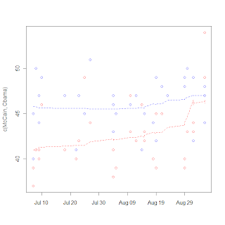
I break from biostatistics for a bit to go into politics, specifically the tracking of polls. Polls are very noisy, and it's really hard to discern real trends (such as convention bounces or even long-term trends toward/away from candidates. The real hard statistical work seems to be in survey selection and sampling, but then on the backend in the reporting not much more is done. Unless you're these guys. So I tried my hand at it a little bit, just being an amateur with a PhD. I collected some poll data and tried my hand a using a LOESS rather than a 3 day moving average. I got the graph on the right.

It's notable that the one point seems to be an outlier (I think that is the Gallup poll that is being criticized in the left-leaning blogs), and McCain's bounce is very noticable, but certainly more data will be needed to show the size of the bounce, as LOESS is susceptible to boundary effects. I do like the fact that LOESS has a longer memory than a moving average and can make the "memory" fade over time rather than either consider it or not. I really wonder what's going to happen to McCain's huge "bounce" with next week's data.